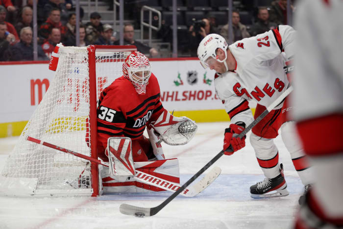
In the Adidas and NHL reverse retro program, teams such as Arizona, Minnesota and Los Angeles have impressed many with their looks (as seen here). But for other teams, one or both of their jerseys left fans wanting more. Here are three of the biggest examples.
The Carolina Hurricanes Throw Back to 2019
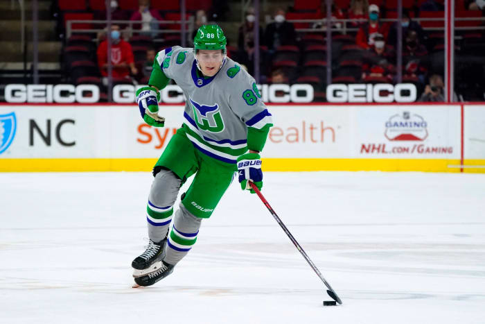
When the first reverse retro jerseys were unveiled, the Carolina Hurricanes earned praise for taking the look of the Hartford Whalers in 2020-21. The Whalers design on a gray jersey was among one of the better looks in the first collection.
Many expected the Hurricanes to have another amazing jersey, and a red Whalers jersey concept was created by designer Alex English, who has been at the forefront of other looks in the program. At the 8:22 mark of the reverse retro summer preview by Icethetics, you’ll get a glimpse of it.
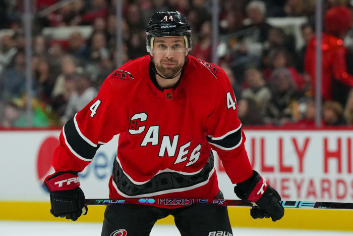
Sadly, a Whalers jersey in Hurricanes colors wasn’t meant to be, as the Hurricanes’ second reverse retro used a crest that was first unveiled in 2019.
It’s fine, but it’s a boring look. Carolina’s jersey is similar to what this team already has in its collection and has to be one of the most disappointing jerseys of the reverse retro program.
The Chicago Blackhawks Stumble Twice
Some teams needed a second crack at the reverse retros to get it right, while others took a step back with what they unveiled for the 2022-23 season. The Chicago Blackhawks missed the mark this season, and the revelation of their first reverse retro in 2020-21 was embarrassing.
The Blackhawks have faced pressure to change their logo and branding away from using Native American imagery, but there has been no indication that they plan on doing so. Whatever your stance on that may be, Chicago faced heat when the NHL revealed the 31 jerseys. The angle of the Adidas model didn’t even show the full crest.
It sparked many questions, with one of them being: if there was apprehension over showing the logo directly, why continue to use it?
The program in Chicago’s second jersey is based on their 1938 look and moved the logo to the shoulders of the jersey. But the striping of the uniform had many wondering why it came across as very generic and being too similar to what the Red Wings released for 2022-23.
Speaking of Detroit…
Detroit Red Wings Need One More Try to Get Reverse Retros Right
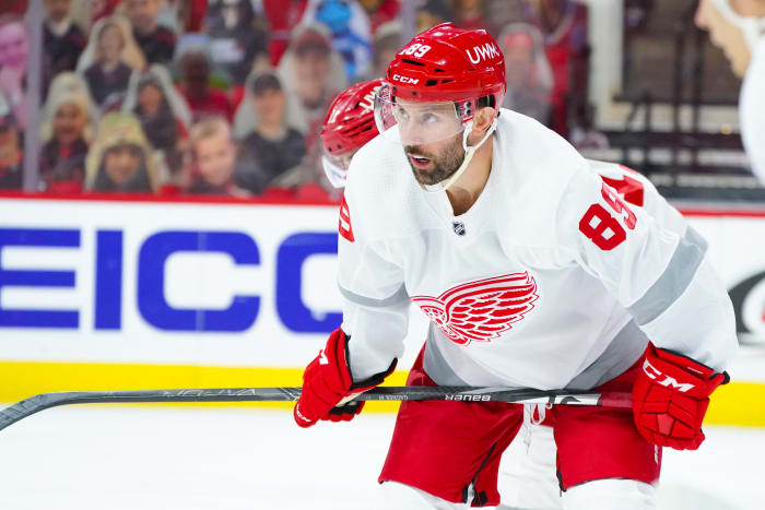
Virtually every list and hockey personality had Detroit’s reverse retro jerseys among the bottom tier of the NHL in both editions. Preparing uniforms takes months of planning and designs, but the white uniforms with silver stripes gave off the vibes that these were created in just a few minutes.
In their past, the Red Wings used the “Detroit Falcons” branding back in the day, and they have yet to use the logo of their original name, the Cougars. There was a tremendous missed chance to add something unique to the jerseys.
Detroit’s look for this season goes all the way back to the early days of the franchise when the franchise was battling the New York Americans and Pittsburgh Pirates.
It is an improvement on what was worn in 2020-21 but not by much. The modern Red Wings don’t have a huge variety of jerseys to “reverse” from their past, but this year’s look once again leaves a lot to be desired.
.
