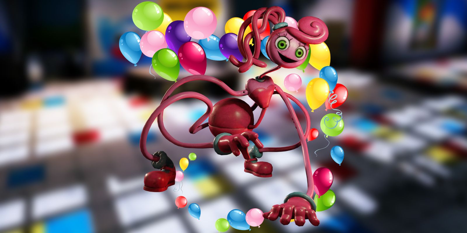
Although Poppy Playtime Chapter 2 is available on mobile platforms as well as PC, the lack of immersion and smaller screens reduce the horror element.
Given the success of the first chapter of the indie horror game Poppy Playtime, it didn’t come as much of a surprise when the game received a mobile port in early 2022. Shortly thereafter, the second chapter came out on PC. Now, Poppy Playtime Chapter 2 is finally coming to mobile devices, meaning that an even broader range of players can finally continue the game. Some, however, may be wondering which platform provides the better gameplay experience. Although they’re functionally very similar, there are still some important considerations to take note of when diving into Poppy Playtime on PC versus mobile, primarily relating to the game’s visuals and level of immersion.
Players take on the role of a former Playtime Co. employee in Poppy Playtime, lured back to the abandoned toy factory after receiving a mysterious letter from the company’s other staff, all of whom were thought to have disappeared years earlier. Like many other popular horror games, players can find additional items throughout Poppy Playtime that helps provide more context and depth to the story. Although the game’s narrative is arguably one of its strongest features, the atmosphere built up inside the factory creates a compelling sense of tension. A large part of said atmosphere comes through the audio design and lighting, in particular, as both are used to set up memorable frights.
The latest chapter follows the same design principles, and there are plenty of scares to outrun, puzzles to solve in Poppy Playtime Chapter 2, and flower tidbits to find throughout the game. Unfortunately, its mobile port also suffers from the same drawbacks players likely saw in the mobile version Poppy Playtime Chapter 1. Although the gameplay and story remain identical, the visual quality decreases significantly compared to the PC copy. Seeing as the game’s setting is integral to its horror elements, the downgrade also has the side effect of diminishing Poppy Playtime Ch.2‘s scariness.
Poppy Playtime Chapter 2 Is Less Immersive On Mobile
Although the mobile version of Poppy Playtime Chapter 1 was gradually updated to remove some of the most glaring issues, such as the loading screens that weren’t present in the PC version, not every problem could be resolved due to technical limitations. The same can be said for Chapter 2. There’s an overall lack of visual detail in the mobile launch Poppy Playtime Chapter 2. Players may not be able to pick up on small but important details like the foggy darkness of certain areas or the rust and cracks lining the building, and the game’s models and textures are sometimes so blurry and jagged that it’s easy to get pulled out of the narrative Contrastingly, Poppy Playtime‘s graphics on PC are detailed enough that the building looks like a real location and its occupants feel like genuine threats. It’s harder to see when enemies are lurking in the dark on PC compared to the brightness of the mobile version.
The standard screen size of mobile devices is another factor that might impact the ability for Poppy Playtime‘s scarier horror game elements to come across as truly frightening. Mobile games are usually meant to be played on the go, and players might not be able to tune out their surroundings well enough to fully feel as though they’re actually in the factory. Additionally, given that Poppy Playtime was designed for PC initially and only later ported to mobile, there may be a fair amount of bugs or awkward gameplay hiccups that could diminish the experience. The UI is also much larger and more difficult to ignore on mobile devices. For the sake of Poppy Playtime Chapter 2‘s horror elements alone, the PC version is a worthy investment for any fans of the series, although those who are invested in the story of Poppy Playtime will still get everything they need out of the more convenient mobile edition.

