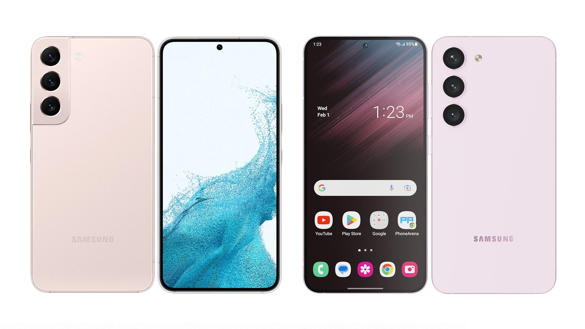
The new Galaxy S23, S23+ and S23 Ultra are less than two weeks from being officially unveiled now (February 1, save the date), and to no one’s surprise, we keep receiving newly-leaked, official-looking renders of the phones.
Well, one of those official-looking renders seems to have sparked what phone nerds would call “an outcry” on Twitter. The image shows a side view of Samsung’s new Galaxy S23 phone, which is strongly reminiscent of that of the iPhone 14 Pro marketing material that we saw last fall when Apple’s flagships were unveiled.
In fact, it’s not just the way the Galaxy S23 is positioned within the picture but also how the shiny aluminum frame of the phone gives out a similar iPhone 14 Pro-like glow, with muted, yet premium looking colors. In all fairness,
I wouldn’t pay that much attention, if it wasn’t for two things:
- People (and by that I mean tech enthusiasts) really seem to care about the tiny details (always blows my mind, by the way)
- As a company that took numerous “pokes” at Apple and the iPhone with some openly targeted ad campaigns, Samsung surely doesn’t shy away from taking inspiration from the way Cupertino does certain things
Still, this story isn’t based on just this one marketing image. Instead, let’s talk about Samsung’s bizarre (probably one-sided) “love-and-hate” relationship with Apple and the iPhone. I’d also like to give some primetime to the actual aesthetic look of the new Galaxy S23 and S23+ phones – as it turns out, many Twitter peeps find them a bit “bland”, and while I really like some aspects of Samsung’s design, I think I can see why some Android users are disappointed…
Galaxy S23 design shows Samsung has firmly taken after Apple’s idea of “slow innovation”; forgets about Android competition

Galaxy S22 (left) and Galaxy S23 (right).
As someone who does whatever I do (we aren’t sure yet) for a living, it’s not hard to see that Samsung has been mimicking Apple’s “incremental upgrade” strategy for 2-3 years now. And as I’ve shared in recent stories, I actually find this to be the right move, as it gives the South Korean company enough time to pay special attention to certain details of the user experience and successfully deliver exceptional Galaxy flagships (which Samsung has been doing for a few years now).
That being said, what I certainly do not mean by that is that Samsung should put itself in an “Apple box” and give us nearly identical-looking phones 2-3 years in a row. Before you ask, yes, Apple can (and does) get away with that, but that’s only because the iPhone is the only phone in the world that runs iOS.
Samsung, on the other hand, is competing with a ton of other Android phone-makers, and lately, it seems like some of them have been getting really good at… design.
As I’ve said before, phone buyers choose mostly with their eyes, and therefore this aspect of phones might turn out to be far more important than some might’ve thought:
- Google has been delivering some of the freshest-looking and best-received Pixel phones for two years now, thanks to the likes of the Pixel 6 Pro, which (to me) is the best-looking smartphone I’ve ever held, as well as the Pixel 7 series, which everyone seems to love (me – not as much as I liked the Pixel 6)
- As a different example of betting on looks, there’s the Nothing Phone 1, which, at its core, isn’t that different than any other $400 phone on the market; its special power is that it happens to be dressed up in a very shiny outfit; founder Carl Pei has referred to Nothing’s choice to rely on design as a selling point as a way of making the Phone 1 stand out in a sea of similar-looking slabs; judging by how well the device was received, this might’ve been a successful experiment
- Another example of “fashion-forward thinking” in the world of phones comes from Xiaomi – namely the Xiaomi 13; what’s interesting here is that the Chinese phone-maker is sort of trying to steal Samsung’s own thunder by giving us the phone with the thinnest bezels out there (a title that used to belong to the Galaxy S22); Xiaomi also leans into the idea of making phones that not only work but also look like … proper cameras – of course, the “living” proof being the Xiaomi 12S Ultra (heart emoji; right up my alley)
Buckle up! Twitter users react to new Galaxy S23 design; find it “boring”; too similar to that of cheaper Galaxy phones

Now, I didn’t bring up the aforementioned examples for design (Pixel, Nothing Phone, Xiaomi) for no reason – as I eluded, these are all phones/designs that the general public seems to like and often praise on social media. They are eye-catching, but they also stand out in very different ways…Meanwhile, the new Galaxy S23 series of phones look nearly identical to their predecessors – if not even a bit more bland, at least if we’re looking at the back of Samsung’s new flagships.
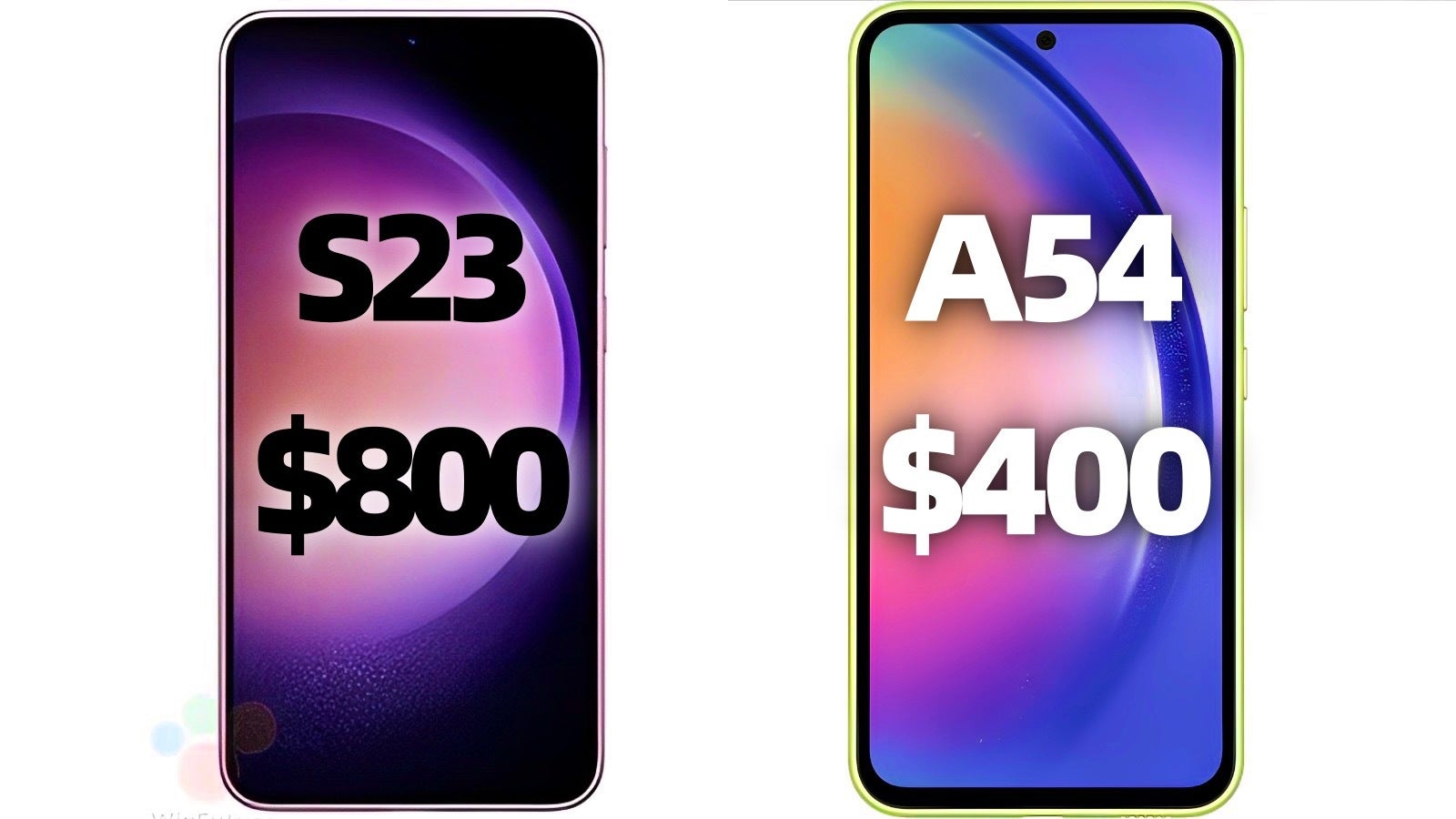
Another topic that’s been discussing on tech Twitter is why Samsung isn’t “afraid” of making its flagship phones look like its mid-range devices, and while this is probably good news for those who buy more affordable Galaxy phones, I can see why Samsung fans want the company to differentiate the $1,000 “S” series from the $300-500 “A” lineup.
The new Galaxy S23 and A54 are expected to look almost identical, not only from the back but also from the front. Again, awesome news for those looking to get a Galaxy A54, but perhaps something that makes users who are willing to spend more, feel a bit less “special”.
Even after the official renders I don’t find it (the design of the Galaxy S23) that good. It lacks character and the S22 design was almost perfect, had a strong character and was unique. Unnecessary change, in my opinion. Now that beautiful design (of the S22) becomes obsolete… It didn’t deserve this. Twitter
This is the A series (see the image above). They’re slowly killing the S series/making it look similar to the A series to really push the Z series as the premium flagships. Twitter
“iPhone… too much?”
Time’s up! Galaxy S24 must bring a new, exciting look (strongly recommend); Samsung might want to stop “mocking” Apple and focus on itself (totally optional)
Anyway, I’m not writing this story to teach Samsung a lesson (why would I be able to teach anything to a company that’s worth gazillions anyway), but to try and talk about what many other Samsung users are already discussing on social media…
To get even more personal, I happen to think the Galaxy S23 and S23+ will be some of the best-looking phones on the market… from the front! That’s thanks to Samsung’s use of symmetrical borders (rumored to get even thinner this year) and a tiny punch-hole cutout for the selfie camera that makes the iPhone’s “Dynamic Island” look like a Dynamic… Subcontinent (coming from an iPhone 14 Pro/ Pixel 7 Pro users).
But just like there’s no two opinions on the fact that the new Galaxy S23 will look far cleaner than the iPhone 14 Pro from the front, the general consensus online seems to be that the S23 phones are shaping up as a bit too bland and unexciting when photographed next to a Pixel 7, a Nothing Phone, or even the new OnePlus 11 (which brings the big camera-bump energy).
Samsung should (probably) take a few more risks, and (maybe) stop “making fun” of Apple
- Grow some cojones (and I mean that in the nicest way possible) and take a look at what Google (fair enough, a company that doesn’t have much to lose) is doing with the Pixel lineup; in other words, don’t be afraid to give us something bold and different, Samsung!; at this point, I’m referring specifically to the Galaxy Fold/Flip 5 and Galaxy S24 series)
- Maybe (just maybe) lose the habit of “mocking” Apple through video ads that I do find funny, on occasion, but mostly cringe-worthy; this only makes Cupertino seem like the more mature, concentrated and focused brand, while making Samsung appear to be whatever the opposite of that is; it also puts a big question mark on Samsung’s carte blanche to take inspiration from Apple and the iPhone’s marketing, design, etc.
As always, whether you agree or disagree with my remarks, the comment section is open! Would you like Samsung to become a bit bolder when it comes to the aesthetic look of new phones, and how do you feel about the whole “poke fun at the competition” thing?