It only feels right the Giants and Dodgers are right next to each other, considering the two have always been attached in history. Did you know the Mets are orange and blue because they took the primary color of the New York Giants and Brooklyn Dodgers after they left? What helps the Giants win out over their arch nemesis is the variety in the set. First of all, the road gray is so much better than you realize. Then there is the orange which is done so well, unlike the Astros or the previous Marlins look. The black alternate is also perfect. One thing that can take the Giants into the top three is adding a throwback alternate. Maybe something paying homage to the Will Clark days by the bay? Would love to see that.
4. Chicago Cubs (Last Year: 6)
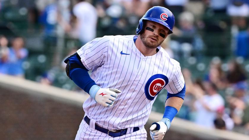
I ended up basically flipping the Dodgers and Cubs, but I also had to pick between the Cubs and Giants. If you know me, you know that is a very tough decision. The reason the Cubs win out is because there is nothing like that pinstripe look on a sunny July day at Wrigley Field. These are beyond iconic. The road grays are underrated, and the blue alternate is just a perfect uniform. A great color, no detail needed, and just the big ‘C’ with the bear walking through it. A perfect logo. Ultimately, having a third jersey in this set is what puts them over the Dodgers. If they didn’t, I would probably have LA ahead of them.
3. New York Yankees (Last Year: 3)
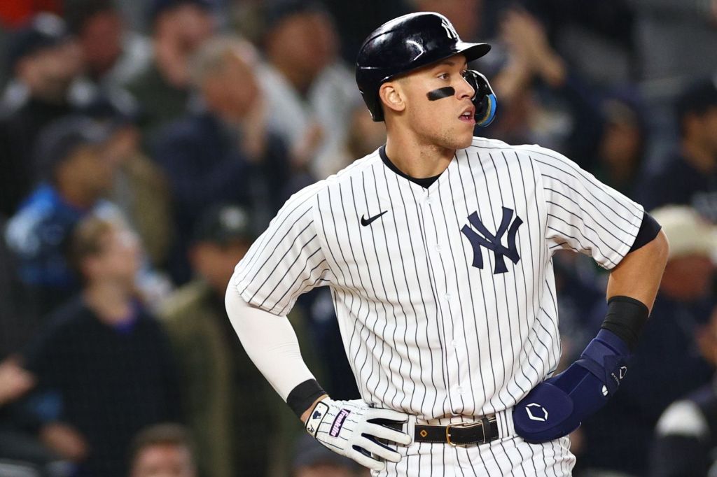
What is there to even say about the Yankees uniforms? They are the most iconic uniforms in sports. All pinstripe uniforms are great, but the Yankees’ are just a tier above all the others. So many greats have accomplished so much in these uniforms and they have basically never changed. I remember going to Yankee Stadium a few years ago and being in disbelief watching those pinstripes run out there. I think that was when it hit me the history I was surrounded by in that beautiful stadium.
The road grays also deserve a shoutout here! They do not get a lot of love as maybe the best road uniform in the game. I love the cuffs on the sleeves and they are just so simple and perfect. The no names on the back is always a great touch. This might sound absolutely insane, but wouldn’t a navy alternate be awesome?
2. Oakland Athletics (Last Year: 1)
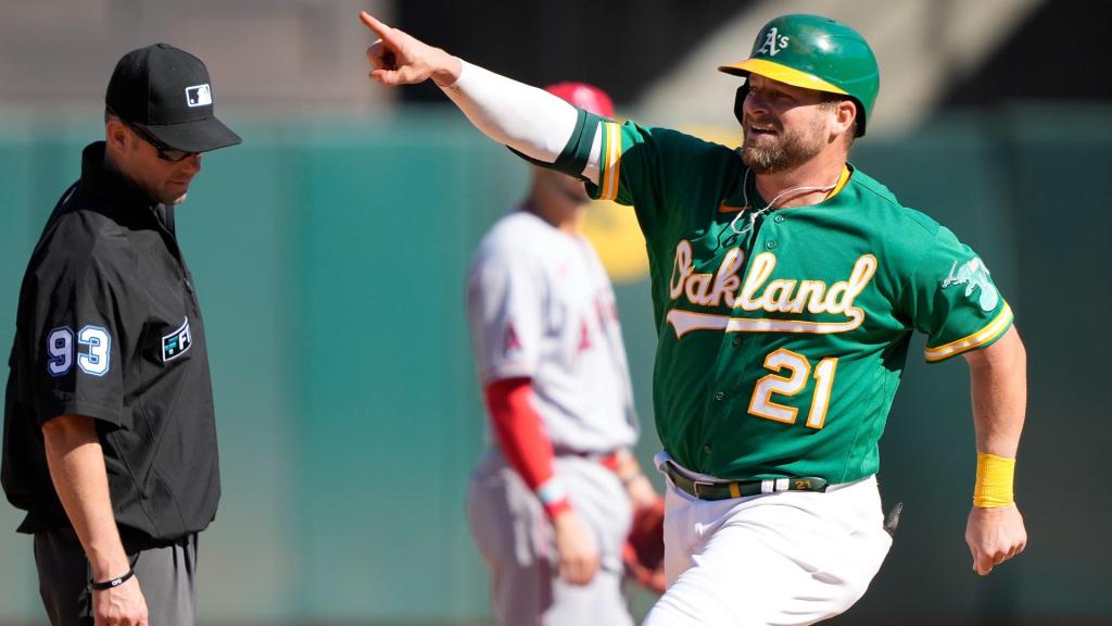
About a year of thought went into this move but I realized it had to be done. Putting the A’s in the top spot last year turned out to be very controversial. It also turned out to be wrong. I let the beauty of the home whites, road grays and dark green alternates get to my head. The problem is, I really like the lighter green alternates, but not as much as I thought I did. Nevertheless, this is basically a perfect uniform set. Everything about it, right down to the white cleats with the home uniforms.
The road grays do not get almost enough love, and somehow people forget that those home whites are a top-three home uniform in the sport. In the end, the main reason I moved the A’s down is not anything to do with the A’s. It is way more about who I decided to put above them.